As for pricing, this part of the analysis details domestic and international supply and demand models through a causal loop diagram and a stock and flow model. Processes assume the products being discussed are meal kits, wine, and kitchen utensils since all three product lines exist at Blue Apron.
Figure 1 shows a causal loop diagram for supply and demand model that assumes domestic sales. It is adapted from a causal loop diagram presented by Sokolowski & Banks (2012) though the one below relates specifically to Blue Apron.
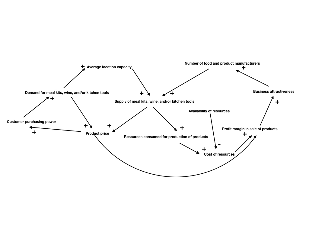
Figure 1. Causal loop diagram for supply and demand model assuming domestic sales.
Almost all relationships in Figure 1 are positive. For example, an increase in the number of food and product manufacturers that can supply the company complements an increase the supply of meal kits, wine, and kitchen tools. The single negative relationship is in the availability of resources. If resource availability drops, then the cost of resources goes up. However, if resources are plentiful, then the overall cost goes down. In relationship to price, one strategy for Blue Apron would be to investigate reducing costs where it can. Reducing costs would create savings elsewhere and thus feed this loop in a way that increases profits.
Figure 2 shows a stock and flow model for supply and demand model that assumes international sales. It is adapted from a causal loop diagram presented by Sokolowski & Banks (2012) though the one below relates specifically to Blue Apron.

Figure 2. Stock and flow model for supply and demand model assuming international sales. It would be ill-advised for Blue Apron to pursue an international supply chain. Such a measure would require a new location overseas, and this extremely high-risk endeavor based on what is already a weak supply chain would not be a good idea. However, if the company was able to create products that are attractive to an international market that align with the specialty diet strategy, then Figure 2’s stock and flow model could be leveraged as well as inform pricing. It shows the interconnectivity of the supply and demand sides. The black diamonds indicate areas where the flows (or rates of change) can go up or down. The boxes indicate accumulations, in this case supply, demand, product inventory, and resources. Visualizing this system allows company stakeholders to speak the same language when strategizing around things like supply chain conversations.
